- Community
- :
- Connect
- :
- Best Practices & Use Cases
- :
- Re: Can DR Indicate Trends in my Data
- Subscribe to RSS Feed
- Mark Topic as New
- Mark Topic as Read
- Float this Topic for Current User
- Bookmark
- Subscribe
- Mute
- Printer Friendly Page
Can DR Indicate Trends in my Data
- Mark as New
- Bookmark
- Subscribe
- Mute
- Subscribe to RSS Feed
- Permalink
- Printer Friendly Page
- Report Inappropriate Content
Can DR Indicate Trends in my Data
Solved! Go to Solution.
Accepted Solutions
- Mark as New
- Bookmark
- Subscribe
- Mute
- Subscribe to RSS Feed
- Permalink
- Printer Friendly Page
- Report Inappropriate Content
Hi Thomas,
You have good instincts converting your multiclass project into multiple binary classification ones. You can get more insights when you narrow the focus of the model to looking at each class independently.
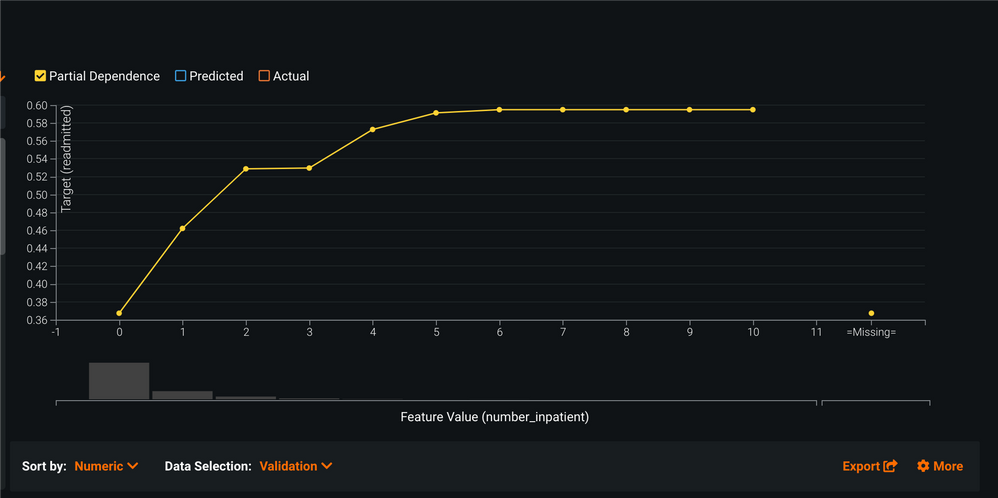
The feature effects graph uses a model agnostic approach called partial dependence. This is calculated by basically taking the feature of interest - in the case below "number of inpatient visits", and calculate what the average target probability would be if every row in the dataset had the same number/category.
For example, below the platform first calculates the average probability of being readmitted if everyone in the dataset has the value = 0 for the "number of inpatient visits" and it plots the result. Next it will do the same procedure but will change all of the rows for that feature to = 1 for the "number of inpatient visits" ...and then it will do the same calculation with all rows using =2 as the "number of inpatient visits"....and so on until the whole range is plotted. In this case there were 11 values.
When completed, this graph tells you that as the "number of inpatient visits" increases, so does the likelihood of being readmitted.
More concretely on the plot below, if everyone in the dataset has a 0 for the "number of inpatient visits" then their average probability to be readmitted (keeping everything else the same) is ~36%. However, if everyone has a 5 for the "number of inpatient visits"(everything else kept the same) then their average probability to be readmitted is ~58%. - which indicates that the "number of inpatient visits" increases with the likelihood to be readmitted.
Does this answer your question?
Emily
- Mark as New
- Bookmark
- Subscribe
- Mute
- Subscribe to RSS Feed
- Permalink
- Printer Friendly Page
- Report Inappropriate Content
@TobeT I'll try and tackle a few questions.
"in the Prediction Explanations, how do i know what blue (X-Axis 0-0.05) and what red (0.5-1) is in terms of my target?"
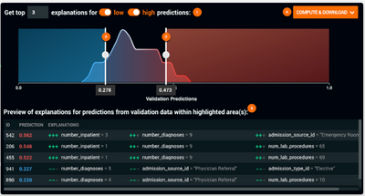
- By default, the colored regions correspond to the top and bottom 10% of the prediction distribution. You can adjust those sliders to whatever you prefer or is relevant for your business case.
"DR wouldn't let me saying "Series "Production Date (Month)" contains multiple rows with the same timestamp"
- There are a few things to consider:
- Do you want to use time to help you predict what is going on right now? Or do you want to predict what will happen in the future?
- Today => use OTV (Out of time validation). Having duplicate date-time data will not be a problem
- Future => use Time Series Modeling.
- It sounds like you have multiple time-series sets within a dataset and have duplicate time-date values. If you change the toggle to Multiple Series ("Yes, there are multiple series"), then DataRobot will automatically detect ways it could group the data that will allow use in a single time-series project. If DataRobot doesn't detect a feature it can use to separate your data, then you may need to think about creating a feature that allows you to do so. What category would you like to track over time? Do you need to break your dataset into smaller projects?
"My main goal is for DR to work out what problem the customers have. So far i got really good results, even on multi-variate when I trained DR with 1000 of the 5000 complaints that i have 'binned' to problem groups myself.
What i found is that DR doesn't give me feature insights at all if I have more than two targets, so now I'm going through my problem grouping 1 by 1 eg. Broken Screen = True or False. Then using the same data with target 'Broken Battery' = True or False. "
- Given your level of R or Python programming ability, using one of our APIs would make the model building process for the numerous binary classification models extremely fast. This is especially helpful when you are considering building dozens or more projects to model individual components for a single Machine Learning use case. Both APIs have very thorough documentation.
- Mark as New
- Bookmark
- Subscribe
- Mute
- Subscribe to RSS Feed
- Permalink
- Printer Friendly Page
- Report Inappropriate Content
Hi TobeT!
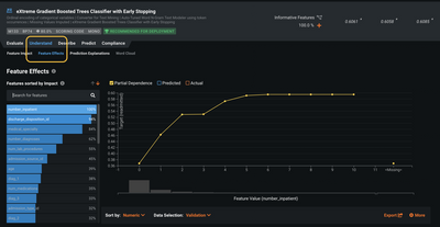
Yes, DataRobot is actually quite good at picking up patterns in your data. One place that you can find your answer is under the Understand >> Feature Effects (see below).
Here you can find charts that look at the relationship between the feature and the target variable using a partial dependence metric. This is a model agnostic approach, so you can get this for every one of you models in the platform. Here is a link to more information about interpretability tools.
In this specific example for a readmission use case, you can see that as inpatient visits increases, the likelihood to be readmitted to the hospital also increases.
I hope this answers your question, and thanks for posting again!
Best wishes,
Emily
- Mark as New
- Bookmark
- Subscribe
- Mute
- Subscribe to RSS Feed
- Permalink
- Printer Friendly Page
- Report Inappropriate Content
Hi @TobeT ,
To add onto Emily's response, one other area to explore is "Prediction Explanations". This will show you at the per row level (e.g. customer) what features contribute to that particular model's predictions and how strong they are. So, for example, you might see that for Customer 123 they are more likely to have a phone repair because they have replaced 3 phones in the past year, are 17 years old, etc.
With regards to trends, are you using DataRobot's time series product, AutoTS? If so that product will automatically generate hundreds to thousands of features that capture trends (e.g. rolling 7 day, 14 day, 28 day averages, seasonal trends, etc.). These are "special patterns" will be incorporated into the models and can be visualized in the Feature Impact and Feature Effects screens for all models.
Does that help?
Duncan
- Mark as New
- Bookmark
- Subscribe
- Mute
- Subscribe to RSS Feed
- Permalink
- Printer Friendly Page
- Report Inappropriate Content
Thanks Emily/Duncan,
I'm currently on vacation so i will come back to you guys in a short while. I have seen these features but somehow couldn't make much sense of it and it also didn't seem to correlate with my manual findings.
I will play around a bit more once i'm back next week and come back to you with more specific detail of my analysis.
Appreciate the quick responses and info.
Cheers,
Tobe
- Mark as New
- Bookmark
- Subscribe
- Mute
- Subscribe to RSS Feed
- Permalink
- Printer Friendly Page
- Report Inappropriate Content
@TobeT It sounds like you are interested in understanding the impact of time-dependent 'trends' in your data. DataRobot can definitely show you those features if you are using the AutoTS product and data from the period of periodicity or seasonality that you expect is within your Feature Derivation Window, the settings used to determine how far back to create lagged values.
There are several very easy ways to see this in the platform, and are consistent with what @emily and @duncanrenfrow mentioned above. They discussed one evaluation of 'trend' (a changing moving average), but I'm unclear if you are looking for 'trends' or 'patterns'. The below discusses 'patterns' associated with seasonality.
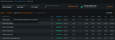
First, we can see the important and/or time-dependent trends in a model-agnostic fashion under the 'Data' tab, here looking at the 'Derived Modeling Data'. You see the features ranked by 'Importance' with their correlation to the target we are trying to predict - in this case 'Sales'. As you see below, some variant of weekly seasonality is very prominent in this data.
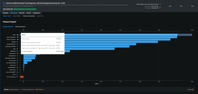
Next, if you look at the 'Feature Importance' for a time-series model, you can see these effects on both the 'Original Features' and 'Derived Features' tabs. From the 'Original Features' tab, you can see this by hovering over a feature. You'll see a pop-up window that breaks down the importance of all variants of the feature (in this case 'Sales'). Below, we see that '7 day average baseline' is the most important 'Sales' feature by a large margin.
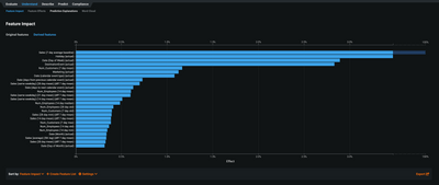
Finally, you can also see this by looking at the 'Derived Features' tab. Here you see all features ranked independently - not grouped like above. In the image below, you see that 'Sales (7 day average baseline)' is by far the most important feature for predicting future sales. As before, you see that many of the other important features are showing 7, 14, or 28 day seasonality - all variants of weekly seasonality.
Do you have other questions about this?
- Mark as New
- Bookmark
- Subscribe
- Mute
- Subscribe to RSS Feed
- Permalink
- Printer Friendly Page
- Report Inappropriate Content
Hey Emily/Duncan/Jarred,
thanks for the elaborate explanations. I've tried a few things with my data, but keep getting stuck with too many question marks.
I will explain a bit more about my data which might help you guys to understand why I'm constantly getting stuck.
My data contains 5000 customer complaints consisting of: customer/technician feedback(most important), production date, repair date, model, serial number, repair shop, repair area.
My main goal is for DR to work out what problem the customers have. So far i got really good results, even on multi-variate when I trained DR with 1000 of the 5000 complaints that i have 'binned' to problem groups myself.
What i found is that DR doesn't give me feature insights at all if I have more than two targets, so now I'm going through my problem grouping 1 by 1 eg. Broken Screen = True or False. Then using the same data with target 'Broken Battery' = True or False.
This way i got feature effects. @emily the target readmitted on the Y-Axis Feature Effect, how can i understand that value, is that %-tage of how much that influences my target?
@duncanrenfrow in the Prediction Explanations, how do i know what blue (X-Axis 0-0.05) and what red (0.5-1) is in terms of my target? The explanations below eventually lead me to the answer, but there might be an easier way to work it out. I also found that the prediction explanation uses some very random factors which worries me that i have overfitted the regressions.
@jarred I have tried to do time series modelling, but DR wouldn't let me saying "Series "Production Date (Month)" contains multiple rows with the same timestamp. Consider removing duplicate dates first, or aggregating the data to distinct time values (e.g., daily rows)."
For sure my data has multiple customers complaining on the same days/month, if i can only have 1 time stamp that wouldn't that limit my training data to 12 rows (12 consecutive months).
I got a bunch of more questions but will leave it to that for now. Thanks all for your patience. I've requested some training from my USA counterparts as I'm the only one in Australia working on DR.
Cheers,
Thomas
- Mark as New
- Bookmark
- Subscribe
- Mute
- Subscribe to RSS Feed
- Permalink
- Printer Friendly Page
- Report Inappropriate Content
Hi Thomas,
You have good instincts converting your multiclass project into multiple binary classification ones. You can get more insights when you narrow the focus of the model to looking at each class independently.
The feature effects graph uses a model agnostic approach called partial dependence. This is calculated by basically taking the feature of interest - in the case below "number of inpatient visits", and calculate what the average target probability would be if every row in the dataset had the same number/category.
For example, below the platform first calculates the average probability of being readmitted if everyone in the dataset has the value = 0 for the "number of inpatient visits" and it plots the result. Next it will do the same procedure but will change all of the rows for that feature to = 1 for the "number of inpatient visits" ...and then it will do the same calculation with all rows using =2 as the "number of inpatient visits"....and so on until the whole range is plotted. In this case there were 11 values.
When completed, this graph tells you that as the "number of inpatient visits" increases, so does the likelihood of being readmitted.
More concretely on the plot below, if everyone in the dataset has a 0 for the "number of inpatient visits" then their average probability to be readmitted (keeping everything else the same) is ~36%. However, if everyone has a 5 for the "number of inpatient visits"(everything else kept the same) then their average probability to be readmitted is ~58%. - which indicates that the "number of inpatient visits" increases with the likelihood to be readmitted.
Does this answer your question?
Emily
- Mark as New
- Bookmark
- Subscribe
- Mute
- Subscribe to RSS Feed
- Permalink
- Printer Friendly Page
- Report Inappropriate Content
TobeT - The y-axis of the Feature Effects graph indicates the score or the prediction probability of the target itself. So in the example where we are trying to predict the likelihood of readmission, the y-axis indicates the probability of readmission, or the change in the probability of readmission if you were to change the input value shown in the x-axis while keeping all other factors (input variables) constant. In your example the y-axis would indicate the probability of a broken screen. The overall shape of the plot would show how a change in the input value of a variable of interest changes the predicted probability, when you keep all other factors constant.
At high level, I like to explain that Feature Impact shows you what variables are most important in your model, and Feature Effects explains the directional relationship of each variable used in the model.
In technical terms Feature Effects is also known as a partial dependence plot.
- Mark as New
- Bookmark
- Subscribe
- Mute
- Subscribe to RSS Feed
- Permalink
- Printer Friendly Page
- Report Inappropriate Content
@TobeT I'll try and tackle a few questions.
"in the Prediction Explanations, how do i know what blue (X-Axis 0-0.05) and what red (0.5-1) is in terms of my target?"
- By default, the colored regions correspond to the top and bottom 10% of the prediction distribution. You can adjust those sliders to whatever you prefer or is relevant for your business case.
"DR wouldn't let me saying "Series "Production Date (Month)" contains multiple rows with the same timestamp"
- There are a few things to consider:
- Do you want to use time to help you predict what is going on right now? Or do you want to predict what will happen in the future?
- Today => use OTV (Out of time validation). Having duplicate date-time data will not be a problem
- Future => use Time Series Modeling.
- It sounds like you have multiple time-series sets within a dataset and have duplicate time-date values. If you change the toggle to Multiple Series ("Yes, there are multiple series"), then DataRobot will automatically detect ways it could group the data that will allow use in a single time-series project. If DataRobot doesn't detect a feature it can use to separate your data, then you may need to think about creating a feature that allows you to do so. What category would you like to track over time? Do you need to break your dataset into smaller projects?
"My main goal is for DR to work out what problem the customers have. So far i got really good results, even on multi-variate when I trained DR with 1000 of the 5000 complaints that i have 'binned' to problem groups myself.
What i found is that DR doesn't give me feature insights at all if I have more than two targets, so now I'm going through my problem grouping 1 by 1 eg. Broken Screen = True or False. Then using the same data with target 'Broken Battery' = True or False. "
- Given your level of R or Python programming ability, using one of our APIs would make the model building process for the numerous binary classification models extremely fast. This is especially helpful when you are considering building dozens or more projects to model individual components for a single Machine Learning use case. Both APIs have very thorough documentation.
- Mark as New
- Bookmark
- Subscribe
- Mute
- Subscribe to RSS Feed
- Permalink
- Printer Friendly Page
- Report Inappropriate Content

