- Community
- :
- Connect
- :
- Best Practices & Use Cases
- :
- Re: Lift chart vs Residual chart
- Subscribe to RSS Feed
- Mark Topic as New
- Mark Topic as Read
- Float this Topic for Current User
- Bookmark
- Subscribe
- Mute
- Printer Friendly Page
Lift chart vs Residual chart
- Mark as New
- Bookmark
- Subscribe
- Mute
- Subscribe to RSS Feed
- Permalink
- Printer Friendly Page
- Report Inappropriate Content
Lift chart vs Residual chart
I am going through the lab to evaluate the regression model.
https://university.datarobot.com/stack-overflow-lab-i
I found a question asking - The Lift Chart supports what we found in the Residuals plot.
The answer is True. However, to my understanding, the answer should be False.
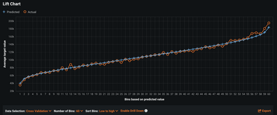
The residual chart shows that the model is not predicting well for low-income and high-income segments. The lift chart shows the blue and orange lines track each other, hence the model is predicting fine.
Then I am confused as to why the lift chart is supportive of the residual plot.
Thanks.
- Mark as New
- Bookmark
- Subscribe
- Mute
- Subscribe to RSS Feed
- Permalink
- Printer Friendly Page
- Report Inappropriate Content
It's a good question. In general, lift charts are providing averaged values based on some "bin" size. The default is 10 which is averaging predicted and actuals at decile ranks. If you toggle the bin size to something larger like 60, you'll start to see some separation at the high end of the salary range. (Screen shot below).
In general, I would just add that lift charts help you tease out how well your model can rank predictions from high to low. This is particularly informative for classification tasks, where you want to compare not just accuracy, but how well the predicted probability matches the distribution of the actual data. It is a bit less useful for regression problems simply because it's possible to have a large RMSE but see a tight lift-chart because the individual observations are all averaged together under these bins.

